 Grand Theft Auto V EnhancedFetching price
Popular PicksView All
123456789101112
12 Best Mystery Games on PC (2026)
12 Best Space Sim Games on Steam (2026)
12 Best Story-Rich Games to Play (2026)
12 Best Turn-Based Tactics Games on Steam (2026)
12 Best Puzzle Games on Steam (2026)
12 Best Games to Play with Friends on PC (2026)
12 Best JRPGs on Steam (2026)
12 Best City Builder Games on Steam (2026)
12 Best Zombie Games on Steam (2026)
12 Best Free Indie Games on Steam (2026)
12 Best Short Indie Games to Try (2026) — Done in One Evening
12 Best Cozy Games on Steam (2026)
Popular Games LikeView All
Games Like PowerWash Simulator - 12 Best Relaxing Cleaning and Restoration PicksGames Like Dave the Diver - 12 Best Diving, Cooking and Systems-Stacker PicksGames Like Road to Vostok - 12 Best Hardcore Survival Shooter PicksGames Like Path of Exile 2 - 12 Best Action RPG and Loot PicksGames Like Clair Obscur: Expedition 33 - 12 Best Turn-Based RPG PicksGames Like R.E.P.O. - 12 Best Co-op Horror PicksGames Like PEAK - 12 Best Co-op Climbing and Survival PicksGames Like Slay the Spire 2 - 12 Best Roguelike Deckbuilders to Play NextGames Like Mina the Hollower - 12 Best Top-Down Action and Zelda-Like PicksGames Like Baldur's Gate 3 - 12 Best CRPGs and Turn-Based RPGsGames Like Monster Hunter Wilds - 12 Best Co-op Hunting and Action RPG PicksGames Like Hollow Knight: Silksong - 12 Best Metroidvania Picks (2026)Games Like Final Fantasy VII Rebirth - 12 Best Action RPG & JRPG PicksGames Like Dead by Daylight - 12 Best Asymmetric & Co-op Horror PicksGames Like Forza Horizon 6 - 12 Best Open-World Racing & Driving Picks (2026)Games Like 007 First Light - 12 Best Stealth and Spy GamesGames Like Solarpunk - 12 Best Cozy Survival and Crafting GamesGames Like Subnautica 2 - 12 Best Underwater and Alien-World Survival GamesGames Like Lies of P - 12 Best Soulslikes to Play in 2026Games Like Hell Let Loose - 12 Best Tactical Milsim Shooters
Popular ReviewsView All

Mina the Hollower — Review

Clair Obscur: Expedition 33 — Review

Schrödinger's Call — Review

Resident Evil Requiem — Review

Shift At Midnight — Review

Mixtape — Review
Middle-earth™: Shadow of Mordor™ — Review

The Mermaid Mask — Review

MOLE — Review

Desktop Explorer — Review

Mad Max — Review

Go-Go Town! — Review

Dead as Disco — Review

Crushed In Time — Review

Beastro — Review

Moonlight Peaks — Review
Even GTA 6’s cover is sparking debate, this time over its neon color palette
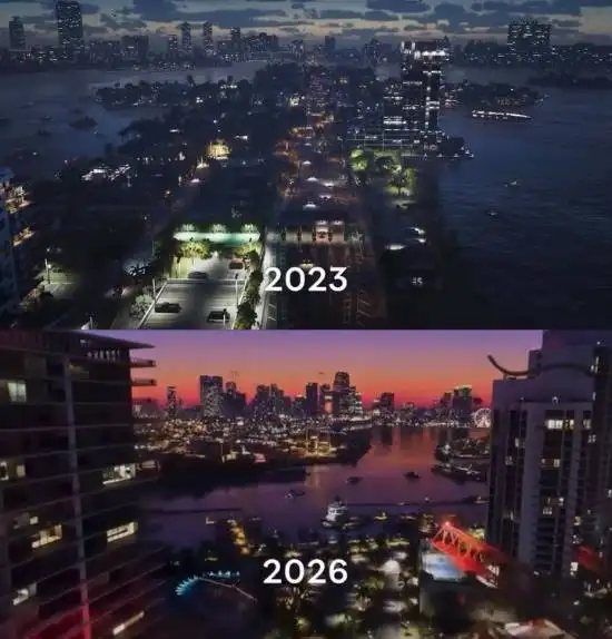
GTA6 has triggered a backlash across multiple overseas social platforms after its cover art and related visual assets were revealed. Some players are openly calling for a boycott, arguing the game has gone "Woke" because its logo, Vice City sunset imagery, and official key art lean heavily on pink, blue, and purple. Others are pushing back with a simpler argument: those neon colors have been part of the series' visual identity since 2002's Grand Theft Auto: Vice City.
The striking part is how much of this argument hinges on color alone. For longtime players, that neon-sunset palette is almost inseparable from Vice City. It reads less like a new direction than the return of a familiar visual signature.

The basic counterpoint is straightforward: if you played Grand Theft Auto: Vice City, you probably would not see this palette as any kind of new signal. That is also the core of the rebuttal. Pink, neon blue, and teal have been a defining part of the series' visual language since 2002, and the look is widely understood as a tribute to 1980s Miami retro-neon style, not modern political messaging. That argument makes sense. It feels less like a sudden pivot and more like the return of a familiar motif, the kind of color design that sets the mood immediately.
But social media debates rarely stay focused on design history. Critics are not just fixating on the logo, sunset backdrop, and cover palette. They are also resurfacing Take-Two's past official posts and reports about diversity and inclusion as evidence for their claims. That turns what could have been an argument about art direction into a broader ideological fight, where the cover itself is no longer the real subject.

None of this is especially unusual in game communities. One side treats the color scheme as a statement; the other dismisses the backlash outright. Based on what is public so far, only a few things are clear: the controversy is real, Rockstar's visual materials do use these colors, and many players are right to say the art direction strongly aligns with the historical look established by Grand Theft Auto: Vice City. The "nothing to do with modern political correctness" rebuttal lands because it draws on the series' older visual identity.

What matters more here is whether the visual design is coherent, not the outrage cycle around it. Strong art direction should serve a game's tone first and let players read the mood for themselves, not have its meaning dictated in advance by online discourse. Based on what has been shown so far, there is not enough evidence to equate GTA6's neon palette directly with any specific declaration. At the same time, it is not surprising that some players keep making that leap by tying it back to Take-Two's past public stance on diversity and inclusion.
For most players, this looks more like a snapshot of community sentiment than a serious reason to buy or skip the game. The original source did not mention GTA6 platforms, the developer's formal company name, or release information, so staking out hard positions over a single cover image feels premature. It makes more sense to wait for the next round of footage and a clearer look at the world and mission design. In the end, whether GTA6 delivers will be decided by the game itself, not by a color argument on social media.
Grand Theft Auto V EnhancedFetching price On saleHotline MiamiFetching priceCN¥42.00-81%
 On saleCelesteFetching price€19.98-91%
 On saleKatana ZEROFetching priceCN¥50.00-40%


Comments 0
We'd love to hear from you
Welcome! Share your take on this game — being first might come with a surprise.
No comments yet. Be the first!