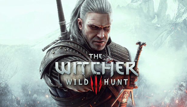
 The Witcher 3: Wild Hunt - Complete EditionFetching price$39.99
Popular PicksView All
123456789101112
12 Best Mystery Games on PC (2026)
12 Best Space Sim Games on Steam (2026)
12 Best Story-Rich Games to Play (2026)
12 Best Turn-Based Tactics Games on Steam (2026)
12 Best Puzzle Games on Steam (2026)
12 Best Games to Play with Friends on PC (2026)
12 Best JRPGs on Steam (2026)
12 Best City Builder Games on Steam (2026)
12 Best Zombie Games on Steam (2026)
12 Best Free Indie Games on Steam (2026)
12 Best Short Indie Games to Try (2026) — Done in One Evening
12 Best Cozy Games on Steam (2026)
Popular Games LikeView All
Games Like PowerWash Simulator - 12 Best Relaxing Cleaning and Restoration PicksGames Like Dave the Diver - 12 Best Diving, Cooking and Systems-Stacker PicksGames Like Road to Vostok - 12 Best Hardcore Survival Shooter PicksGames Like Path of Exile 2 - 12 Best Action RPG and Loot PicksGames Like Clair Obscur: Expedition 33 - 12 Best Turn-Based RPG PicksGames Like R.E.P.O. - 12 Best Co-op Horror PicksGames Like PEAK - 12 Best Co-op Climbing and Survival PicksGames Like Slay the Spire 2 - 12 Best Roguelike Deckbuilders to Play NextGames Like Mina the Hollower - 12 Best Top-Down Action and Zelda-Like PicksGames Like Baldur's Gate 3 - 12 Best CRPGs and Turn-Based RPGsGames Like Monster Hunter Wilds - 12 Best Co-op Hunting and Action RPG PicksGames Like Hollow Knight: Silksong - 12 Best Metroidvania Picks (2026)Games Like Final Fantasy VII Rebirth - 12 Best Action RPG & JRPG PicksGames Like Dead by Daylight - 12 Best Asymmetric & Co-op Horror PicksGames Like Forza Horizon 6 - 12 Best Open-World Racing & Driving Picks (2026)Games Like 007 First Light - 12 Best Stealth and Spy GamesGames Like Solarpunk - 12 Best Cozy Survival and Crafting GamesGames Like Subnautica 2 - 12 Best Underwater and Alien-World Survival GamesGames Like Lies of P - 12 Best Soulslikes to Play in 2026Games Like Hell Let Loose - 12 Best Tactical Milsim Shooters
Popular ReviewsView All

Mina the Hollower — Review
Clair Obscur: Expedition 33 — Review

Schrödinger's Call — Review

Resident Evil Requiem — Review

Shift At Midnight — Review

Mixtape — Review
Middle-earth™: Shadow of Mordor™ — Review

The Mermaid Mask — Review

MOLE — Review

Desktop Explorer — Review

Mad Max — Review

Go-Go Town! — Review

Dead as Disco — Review

Crushed In Time — Review

Beastro — Review

Moonlight Peaks — Review
Can The Witcher 4's purple logo even spark DEI backlash?
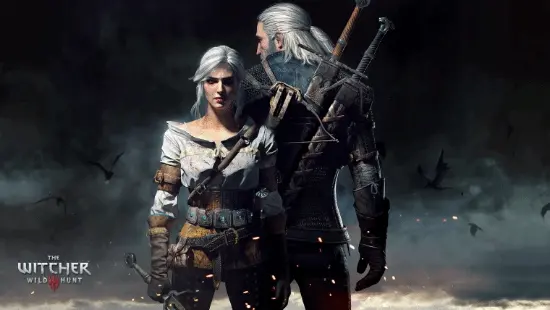
According to GamerSky, players on social media have been linking the purple elements in The Witcher 3's new DLC, The Witcher 4 logo, and Warlock: Dungeons & Dragons to DEI. The fight is not really about a single shade of purple. It is about whether a visual cue should be read as ordinary art direction or as a value statement.
There is a reason the suspicion caught on. The more wary side argues that purple does carry specific meaning in the LGBTQ+ community, especially through its association with bisexual and transgender flags. Add in the fact that Western studios have used related visual symbols frequently in recent years, and the reaction is not baseless. The association has some cultural context.

From a design standpoint, though, treating purple as a direct synonym for DEI is a leap. Purple is one of the most common functional colors in game art. In fantasy, it often signals magic, curses, the void, or aristocratic power. In cyberpunk and 80s neon aesthetics, it is almost part of the basic visual vocabulary. If a The Witcher 4 logo wants to move away from its usual black, white, and red palette, purple is a perfectly available option. It does not need a political memo to justify it.

Color usually works as one part of a game's identity, not a narrative statement on its own. What actually helps judge ideological positioning is the combination of character writing, quest text, camera choices, and marketing language. Judging one hue in isolation is easy, but it also has a high error rate. It is like spotting rounded UI buttons and assuming the whole interface philosophy has changed.

There is also a commercial reason players have become more sensitive to DEI signals. Some Western games in recent years really have handled political or social themes too bluntly, leaving characters feeling like boxes ticked in a requirements document. The result often had the marks of rushed production. That is why the community's "everything is politics" backlash took hold in the first place. The problem is that if the backlash reaches the point where purple itself becomes unusable, studios lose ordinary room for visual expression.

My read is simple: stay alert, but do not let it become autopilot. When looking at The Witcher 3 DLC, the The Witcher 4 logo, or fantasy projects like Warlock: Dungeons & Dragons, the first question should be whether the actual content sacrifices setting, gameplay, or narrative coherence. Color can be an entry point. It should not become the verdict. Player communities should be asking whether the game has done the work on systems and characters, not whether its palette can be converted into a political spectrum chart.
The Witcher 3: Wild Hunt - Complete EditionFetching price$39.99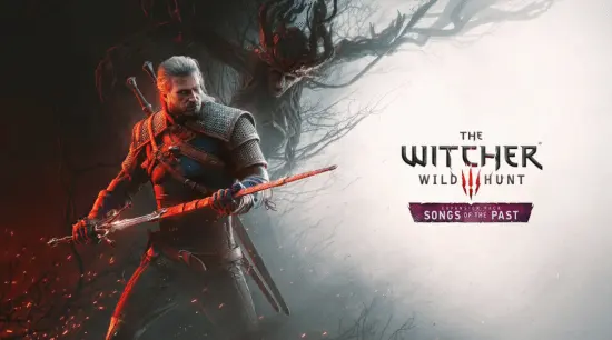
Comments 0
We'd love to hear from you
Welcome! Share your take on this game — being first might come with a surprise.
No comments yet. Be the first!